The IMEX brand’s total refresh saw its debut at its Frankfurt show in May, and Anna Gyseman, design manager at IMEX, showed CMW’s Catie Owen behind the scenes The decision to refresh IMEX’s image came from a desire to modernise the brand, according to IMEX’s design manager, Anna Gyseman. A survey of 50 ex-colleagues showed the team this, and so an 18-month-long process began. The design team followed the advice that the colours were too outdated, but the general design was beloved. “It’s a refresh, not a rebrand,” Gyseman emphasised, further explaining that the new look has neurodiverse viewers in mind as well as including the traditional dots. The focus on inclusivity led to the widespread use of IMEX’s soft brown ‘IMEX biscuit’ colour on sign backgrounds – an inclusive and friendly alternative to stark white. By utilising a non-stimulating background colour and sans-serif fonts to improve readability, the company has put its money where its mouth is regarding its commitment to inclusivity. Although the refresh extends across all IMEX’s signage, including the standardised colours that guide attendees across the show floor, the most noticeable update is to the brand’s renowned logo.
“It’s a refresh, not a rebrand.”
“We presented about 20 different logos”, Gyseman said, describing the team’s process over the 18-month stint. “When we saw this (the new) version, we couldn’t not go with it – we just knew it was the one.” The team included every and all ideas until they narrowed down the perfect image, with rejects ranging from serif font attempts to signs resembling a gaudy restaurant. Overall, they knew that a show as vibrant as IMEX needed a suitable, chunky design that incorporated the iconic handshake, so they chose Gill Sans Extra Bold as their font. “Everything has changed, from letterheads, product design, to web banners,” Gyseman said. She added that IMEX also worked with a company to develop three animations for the logo, which played in between press conferences at IMEX Frankfurt. The team doubled down on the animations, particularly for online, by creating its first sonic logo. UK-based company Buff Motion helped the team design a soundtrack set to a bubbly animation of the logo coming together, much like IMEX’s loyal attendees.
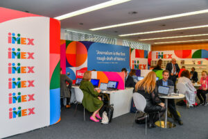
The press lounge’s new look at IMEX Frankfurt